Anarkist-x-Cult

A school project where we got the task to produce a product that was a collaboration between two companies. This case is based on Anarkist the beer company and the Danish energy drink Cult. we wanted to mix two things that usually don't go together, and see how that would look like

Project type: School Project

Duration: 3 weeks

Team: Me and two classmates

Roles: UX Design, UX Research, Visual Design, Branding
Sherpa App Screenshot


A quick TLDR


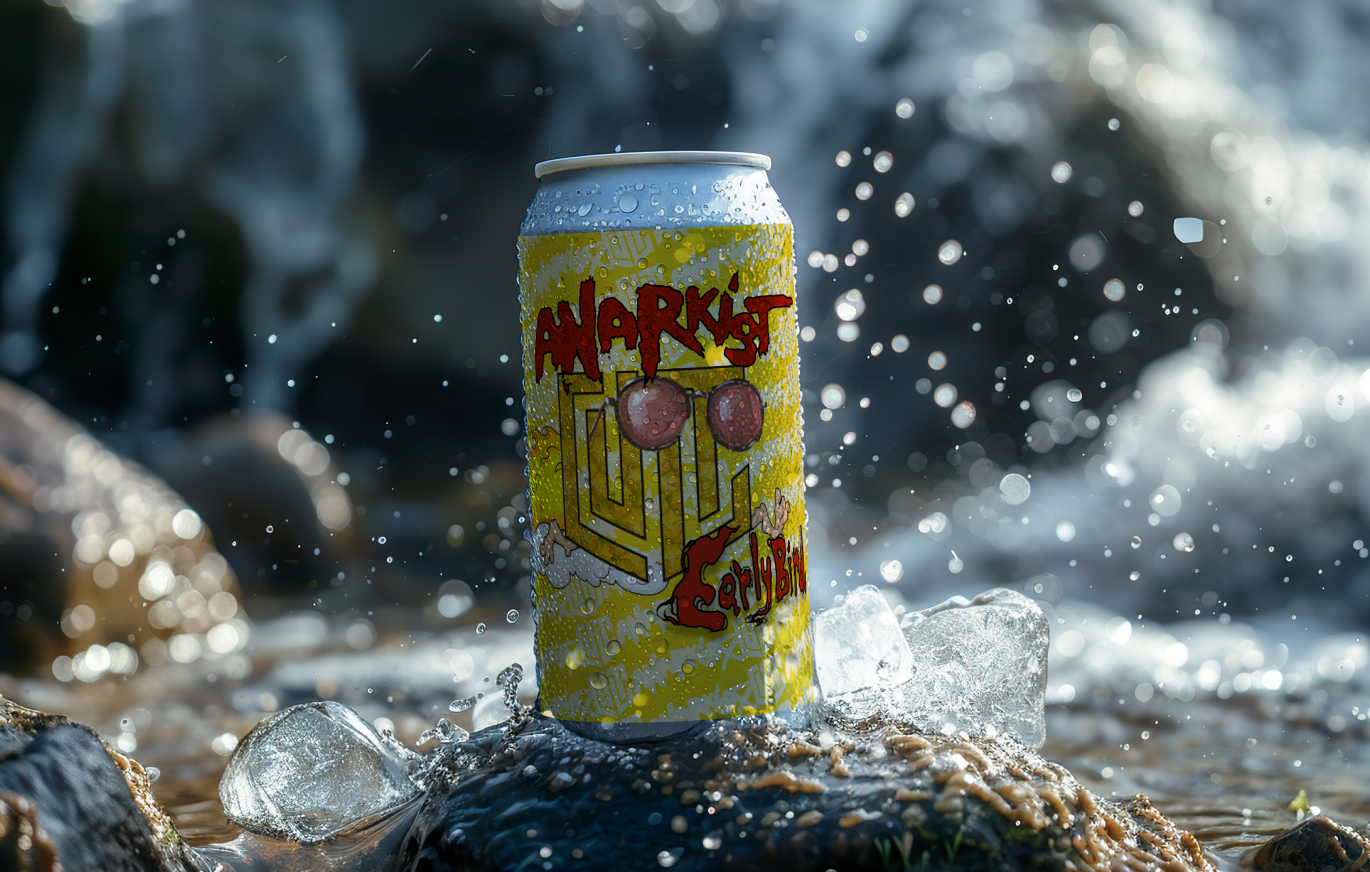
Through multiple itterations we arrived on a product we called Early Bird which tried to combine the fun, energetic look of the Cult energy drinks and Anarkists fun and creative takes on beers.

This would most likely not work as an actual product, but was a fun challange to try and create a visual style of two very different styles and products


So How did we do it?

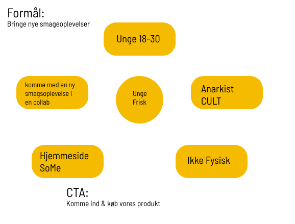
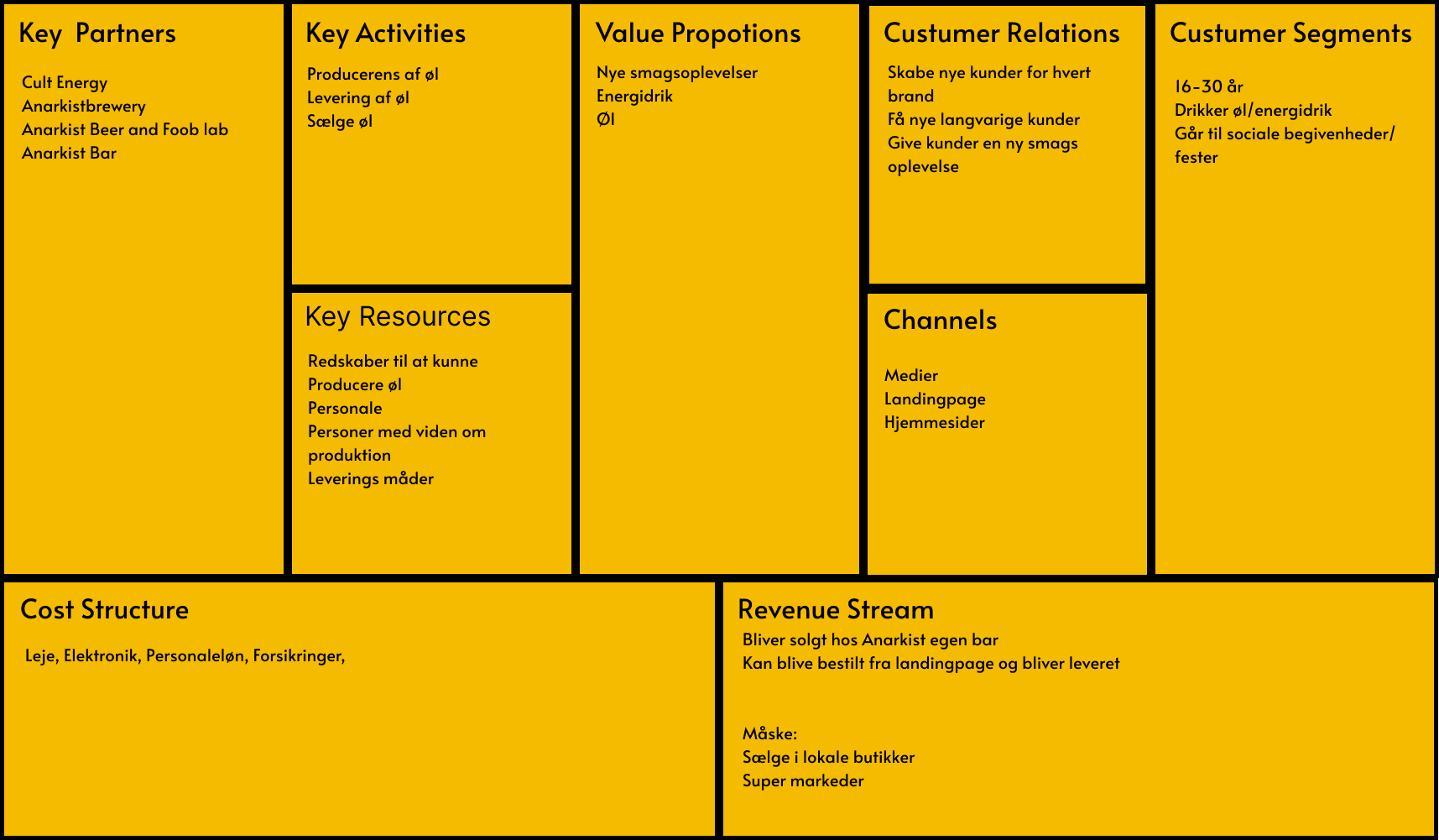
We started by figuring out what our target audiance was and who would buy it... basically Who Are We?

We started this process by filling out a B-model and a BMC. Both to help us figure out who we were and why we were making the product we were making

Anarkistcult
Anarkistcult

Next on the program was to figure out what our visual style would be and what a collaboration between the two companies would look like.

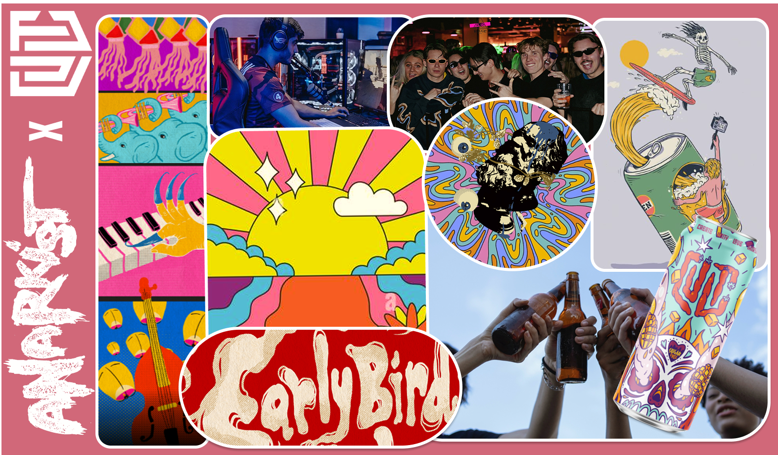
This we did by creating some seperate moodboards, then getting together to fuse those moodboards together.

Anarkistcult
Anarkistcult

On the left we see mine which had a lot of color and no real direction. On the right we see our finished moodboard, which still has a lot of color, but there is still a direction and a visual style. This version is the version before we decided what colours we wanted to use


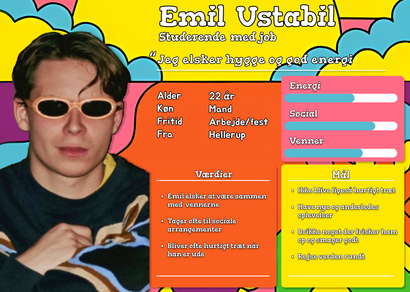
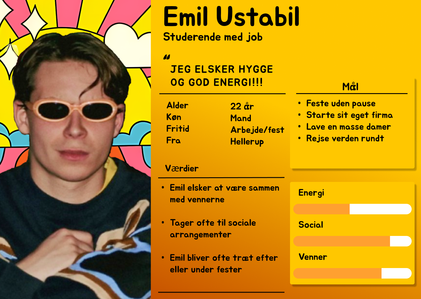
The next step in our process was to make a persona, to figure out what out target audiance would be. We obviously wanted to target young people who liked to party, but we also wanted to target people who liked to be creative and try new things

Anarkistcult
Anarkistcult

Here we were still unsure what exactly type of visual style we wanted to go with which lead to the production of two different visual styles of the personas

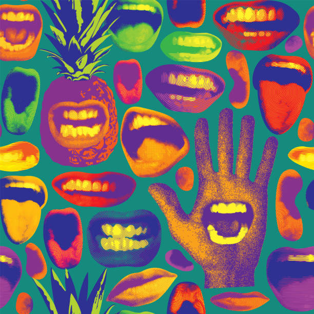
At this point there was a lot of discussion about exactly how our product would look like, and what the visual style would be. Based on our moodboards we tried out with light blue, pink, purple and other kinds of wild colors.


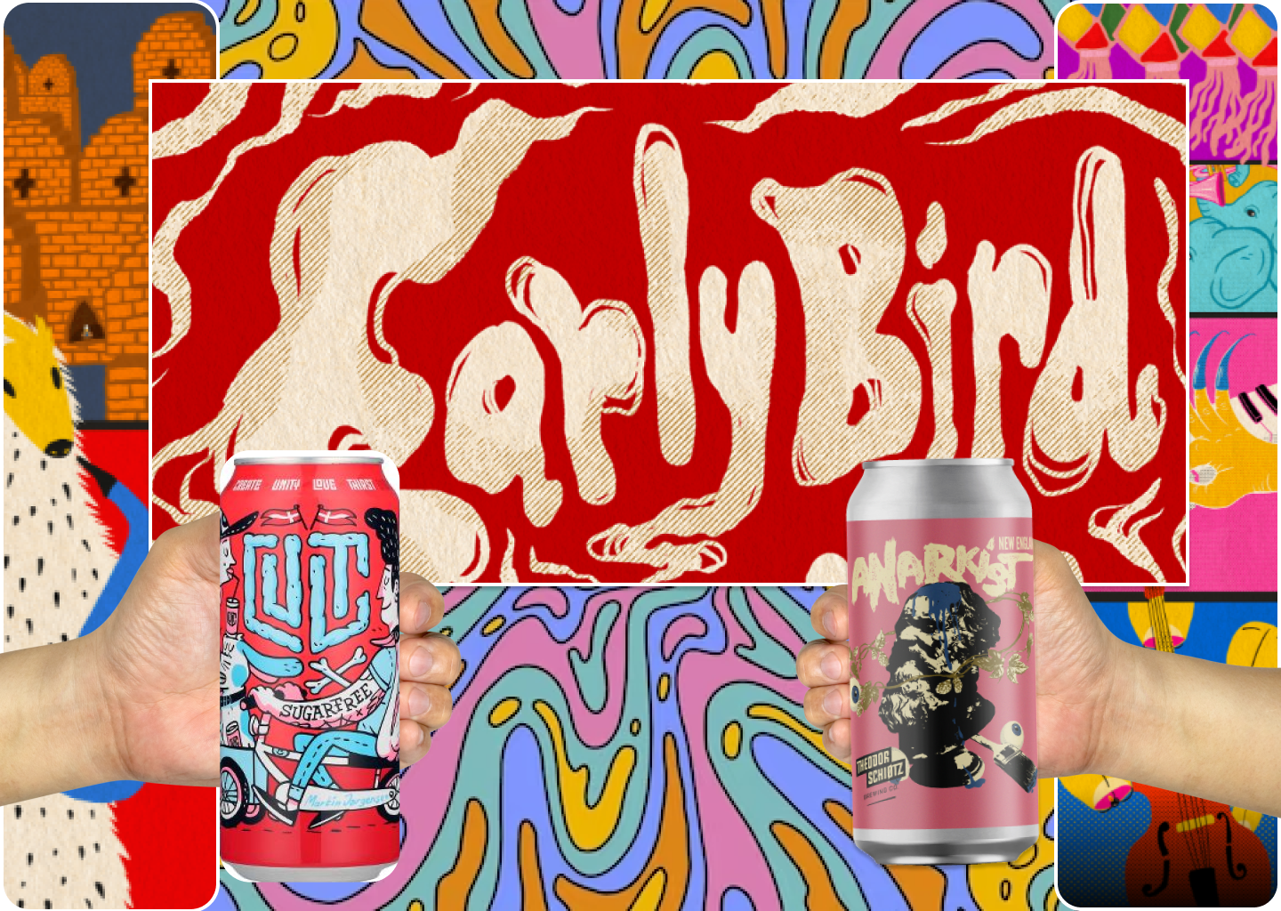
Early on we based a lot of our visual style form this image. Trying out different colors and styles. We quickly realized that none of them gave the right impression. The blues gave a feeling of minty choolness, the pinks too much like a fruity strawberry and the greens too much like a sour lime.

Anarkistcult

after some itterations throught different logos and colour scheems we ended on the yellow and black colour scheem that you see in most of the images.


After getting settled on a visual style we had to figure out what our product actually looked like, and to create some SoMe posts and a content calender for this hypothetical collaboration